How to explain your pricing so customers don’t bounce
After months of building your product, you’ve finally launched it to the public and chosen a pricing model that supports your unit economics. You finally drive traffic to your site whilst avoiding common marketing mistakes, but when potential customers hit your pricing page, they bounce.
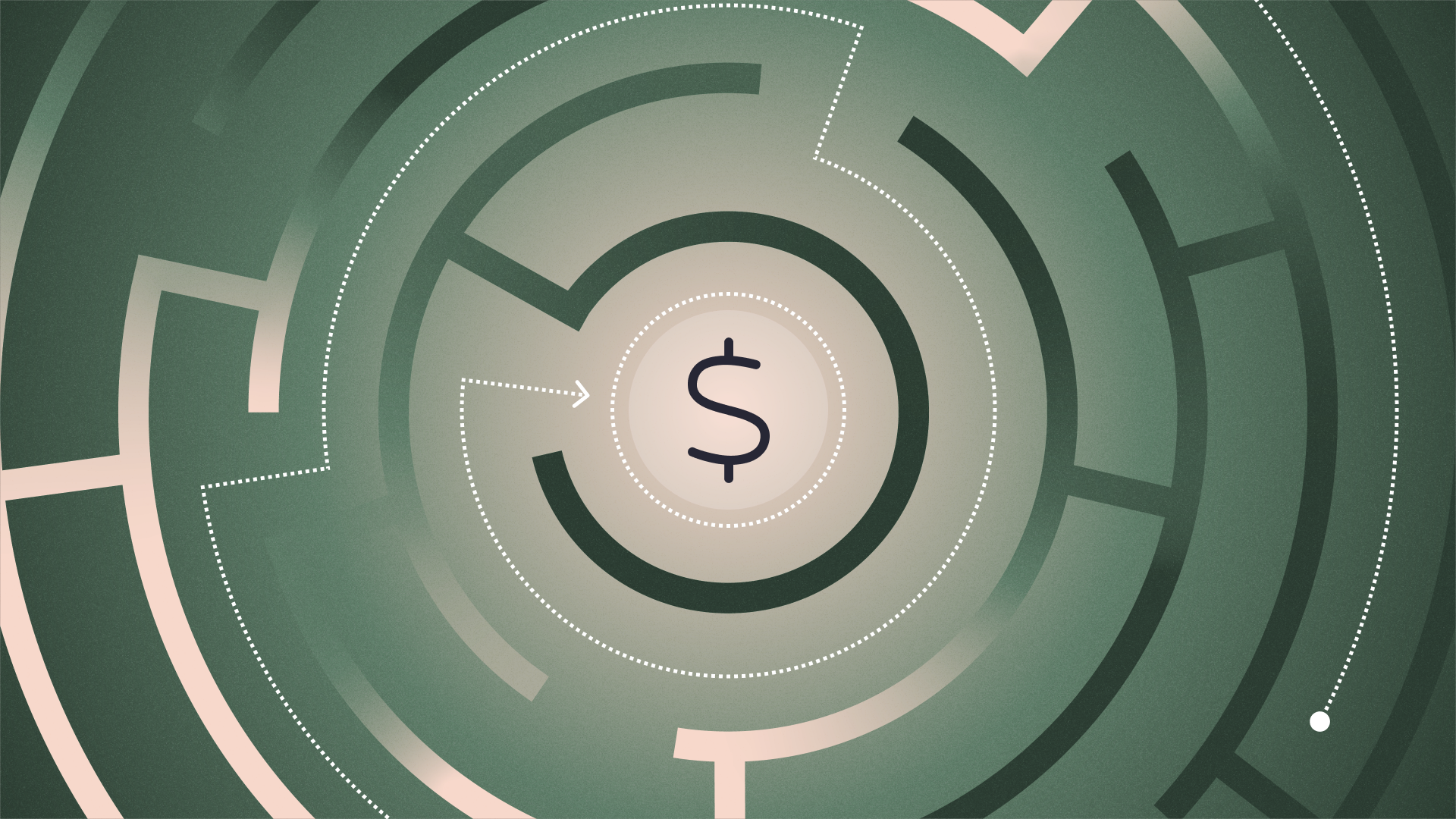
It’s a common frustration for early-stage founders. Often, the assumption is that the price is too high. But frequently, the issue isn’t the number on the page — it’s how that number is explained (and how customers understand the price relative to its value).
Pricing is a story that you tell — and if your story is confusing or too vague, it can meaningfully impact customer conversion.
In this article, we’ll explain the psychology behind how customers review pricing, common mistakes to avoid, and how to structure your pricing communication to build trust and close sales.
The bounce happens before the price is the problem
When a prospective customer lands on your pricing page, they are typically high-intent. After all, they wouldn’t land on your pricing page if they’re not your ICP. They want to buy, or at least understand if they can buy.
But if a user has to do mental math, try to understand your subscription tier names, or guess which plan fits their stage of growth, they will likely leave.
Your goal is to reduce the time it takes for a user to answer four subconscious questions:
- Clarity: What exactly am I paying for?
- Fit: Is this plan designed for a company like mine?
- Value: Does the outcome justify the cost?
- Ease: Can I understand this in five seconds or less?
If your pricing page doesn’t address these immediately, you risk losing the customer, regardless of how competitive your price point is.
Common pricing page mistakes
It’s common to overcomplicate a pricing page in an attempt to be thorough or precise. While accuracy is important, it shouldn’t hinder the customer’s ability to understand their options.
Here are some common pitfalls that lead to customer drop-off:
- Vague plan names: Naming your tiers "Gold," "Silver," and "Bronze" tells the customer nothing about who the plan is for. It forces them to read every line item to discern the difference.
- Hiding key information: If a user has to hover over a tooltip to understand what, for example, a transaction or a seat is, you are adding friction.
- The paradox of choice: Offering too many tiers or add-ons can lead to decision paralysis. Research on SaaS pricing page examples shows that the most successful pages often limit options to three or four distinct tiers to keep users focused.
- Failing to anchor value: Presenting the price before establishing what the customer receives in return puts the price in the spotlight rather than the value customers receive.
- Inconsistent metrics: If one plan charges per user and another per storage metric, comparing values becomes difficult.
How to frame pricing for clarity and conversion
A great pricing communication strategy naturally guides users to the right choice. It feels less like a menu of options and more like a gentle recommendation engine.
Here is how to optimize your pricing page for better conversion rates.
Start with outcomes, not just features
Features are what your product does; outcomes are what your customer gets. While you need to list features for comparison, your headlines and descriptions should focus on the result.
Instead of just listing "SSO and Audit Logs" under your top tier, frame the plan as "For scaling organizations requiring advanced security and compliance." This speaks directly to the buyer’s internal needs and anxieties.
Use tier names that reflect scale
Your plan names act as a self-selection tool. When a user reads the name, they should immediately know if they belong in that bucket.
Consider naming conventions that map to the customer's growth stage or business model.
While tier names like “Basic, Standard, and Premium” are distinctive, they are not actually descriptive. Instead, naming conventions such as “Hobbyist, Professional, and Agency” or “Starter, Growth, and Enterprise” can be applied to the customer's current state to drive prospects to the tier that best fits their needs.
This saves them time and builds confidence that the plan was built for them.
Anchor your value
Price is relative to a user’s perceived value. For example, a $100/month subscription may seem expensive for a "tool," but inexpensive for a solution that "replaces 10 hours of manual data entry."
You can create visual and psychological anchors to help customers understand value:
- Highlight a recommended plan: Use a badge or visual cue (e.g., a different-colored border) to guide users to the tier that provides the best value for most of your customers.
- Use comparison checklists: Clearly show what is added at each tier. Avoid repeating the full list; use phrases like "Everything in Starter, plus..." to highlight the incremental value while making it easy on the reader.
- Show ROI: If possible, include a calculator or a simple copy that frames the price against the cost of the problem you are solving, so customers understand how their pain points are addressed.
5 pricing page do's and don'ts
To summarize, here is a quick checklist to review against your current pricing page:
Best practices | Mistakes to avoid |
|---|---|
Focus on outcomes: Frame tiers by the results the customer achieves, not just what the tool does. | Use internal jargon: Avoid technical acronyms that a new visitor won't immediately understand. |
Use persona-based names: Choose names like "Solo," "Team," or "Agency" to help users self-identify. | Use vague tier names: Avoid names like "Gold" or "Silver" that require users to guess the target audience. |
Anchor price to the problem: Frame the cost against the hours or capital the user saves. | Present price before value: Don't reveal the number before the user understands the outcome. |
Show clear ROI: Use simple copy or calculators to justify the investment relative to the gain. | Use inconsistent metrics: Don't charge by "user" in one plan and "storage" in the next. |
Align tiers with growth: Map your plan names and features to the customer's specific stage of scale. | Ignore the competitive landscape: Be prepared to highlight how your value differs from alternatives. |
Your pricing page is a foundational component of your company’s story. For early-stage founders, closing the gap between a prospect’s interest and their commitment requires lowering friction at every touchpoint. By giving your pricing communication the same attention as the pricing itself, you can build the trust necessary to drive customer conversion and fuel future growth.
If you are looking for more ways to optimize your startup's financial operations, check out our guide on pricing strategies.
Related reads
Building with AI: Turning Claude into a go-to-market strategist

How to make your marketing agency more profitable

How to price your AI product (when it cost you almost nothing to build)