Points of view gathers perspectives around a concept, with each participant choosing their own journey through questions, answers, and the imagination and marvels in between.
For our first Points of view, we explore the concept of details — and how a few sharp minds have polished their ability to tune into them and the subtle signals that separate good work from great work. What follows is a glimpse into that fine-grained attention and how it moves the work forward.
Read more stories like this one in Meridian: Details — on the subtle choices that shape how ambition comes to life.
Here, we spoke to John Nelson, cartographer & UX designer at Esri, a global market leader in geographic information system software, location intelligence, and mapping. Nelson shares his thoughts on a design philosophy that challenges existing checklists, balancing science with intuition, and the stage of mapmaking that resembles impressionist art.
What makes something finished?
My cartography efforts break pretty well along the 80-20 split. The heavy lifting data management and analysis accounts for about 20% of the time I’ll spend on a project. The remaining 80% I’m experimenting with layout compositions, color combinations, label placement, and other doodads of the cartographic milieu.
I’m comfortable sharing a map when the mass of “wait till they get a load of this” energy overtakes the perfection impulse.
It would be easy to fetishize the details and push delivery too-late except for a character flaw that helps me balance that impulse: a ravenous craving for approval. I’m reminded of an episode of The Simpsons where an extended teachers’ strike leaves Lisa in an anxious state of needing to be evaluated. “Look at me! Grade me!” Marge nervously writes an “A” on a sheet of paper and hands it to an appeased Lisa. I get it. I’m comfortable sharing a map when the mass of “wait till they get a load of this” energy overtakes the perfection impulse.
How do you decide what details not to show?
Deciding what not to show is one of the big leveling-up steps in cartography. Often maps are seen as a checklist by their makers: scalebar: check; north arrow: check; neatline: check; basemap: check. But sometimes a map is better (and more correct) without those things. Maps are a communication device for a spatial phenomenon, not a list of ingredients. They are always better when the creation is an austere additive process rather than a blind acceptance of defaults.
So much of our lives can be spent in a mode where we don’t question the defaults and templates of our work; it can become rote and underdeliver on its promise.
I remember reading an anecdote once from designer Hillman Curtis, where his team would stand around a design and one person would point at various elements in the layout and say, “defend” to which the designer would have to provide the reasoning for its appearance in the design. That has really stuck with me. So much of our lives can be spent in a mode where we don’t question the defaults and templates of our work; it can become rote and underdeliver on its promise. To be ready to explain the rational choice of every aspect of a designed item invariably results in more purposeful and focused design.
What role does scale play in your thinking — and how do you toggle between the big picture and the tiniest decisions?
Map making is just a very specific instance of user experience design. As a maker, we have to empathize with our audience to suss out their goals and preferences and frustrations. We need to have a big picture of the purpose of the design and balance that with the individual aspects of each feature’s appearance and behavior. And we get a cohesive result by using the same tools: information architecture, cognitive science… and intuition.
The concept of scale is pervasive in quantitative geography; it’s embedded in the “First Law” of geography: Everything is related to everything else; nearer things are more closely related. Geographic scale dovetails with design scale. Even the smallest phenomenon is part of an interconnected global system, the fun is in keeping that big picture in mind as we craft the minutiae.
What is something in your work that you tend to obsessively fine-tune?
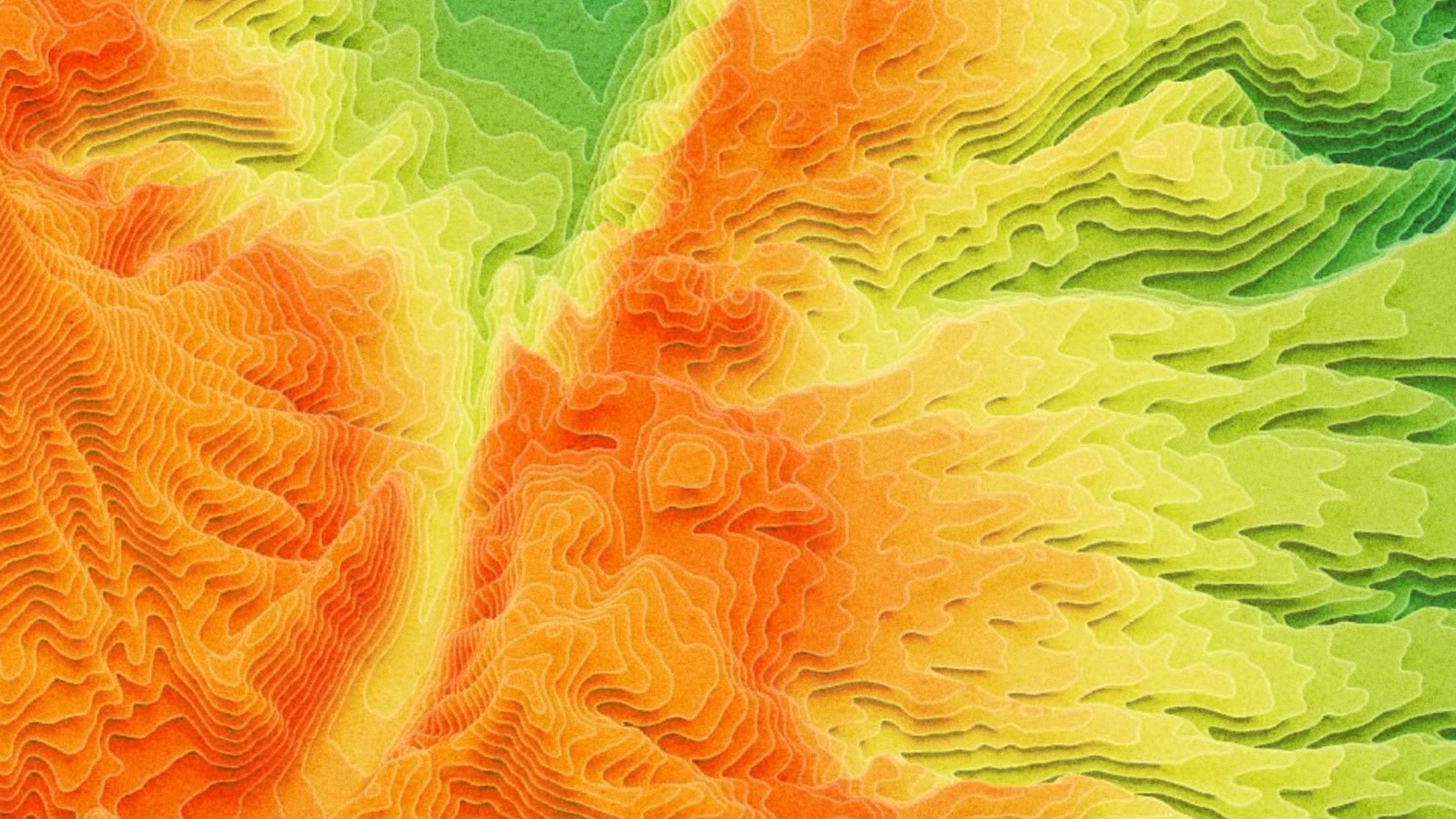
If you asked this question to 10 cartographers, nine of them would say “labeling.” Not me, though; I try to blast through labeling so I can revel in the fun stuff: terrain shading. Often a map benefits from the context of terrain. One of the ways to provide this context is to feather in artificial light and shadow to create an illuminated sense of a place’s relative ups and downs. There are a lot of visual parameters to consider though, and it's a glorious way to spend 20 minutes… only to realize three hours have actually elapsed.
The fun is in keeping that big picture in mind as we craft the minutiae.
Terrain is an opportunity to explore the impressionistic sense of a place, like colors and tone, generalization, ambience, and illumination angle. In nearly any case, a literal reproduction of light on the surface will be inferior to the carefully chosen artistic swipes of a cartographer painting with imaginary light. It’s just the best.
Tamara Rahoumi is a writer and content strategist working at the intersection of finance, tech, and startups. Guided by curiosity, she's drawn to the human stories behind what's being built and enjoys the creative challenge of turning ordinary or technical topics into engaging, unexpected content experiences.